Funism at 30 - The Art of Norm Magnusson - Exhibition Proposal
So much art. 30+ years of making art. Different bodies of work, on-going projects spanning decades; exhibitions, collections, curating, performing; following my creative whims through the profound and the frivolous. So. Much. Art.
TABLE OF CONTENTS
1) 8 select pieces to whet your appetite or not. Easy to digest.
2) Everything else with links to even more of everything else.
3) Click on any image to make it bigger, click on any link to see more of any series.
+ + + + + + + + + + + + + + + + + + + + + + + +
1) 8 select pieces (details immediately below):
 Clockwise from top left:
 • Unarmed Black Men, 2020. 96" x 36" x 4", cast aluminum and acrylic paint,
collection of The Museum of the City of New York.
From the "On This Site Stood" series.
• The Willingness to Trade Civil Liberties for the Illusion of Protection, 2001. 12" x 12" x 19",
parchment replicas of the U.S. Constitution and the Bill of Rights on a plaster cast of a child's gas mask.
From the "After the 11th" series.
• Glasses, 2021. 46" x 46" framed. Archival computer prints of hardcore internet porn, printed on acid free paper, cut into strips and woven together. Mounted on acid free foam core and framed.
From the "Porn Weavings" series.
• fig. 142: some leaves lose themselves in others, 2018. Blue watercolor on green leaf.
Archival computer print, dimensions variable.
From the "Decorating Nature" series.
• Pess/Op, 2006. Archival computer print of digitally manipulated images.
One off.
• The Imposition of Order Upon Nature, 1997. 63" x 63”, Acrylic on canvas, white and black birch frame.
From the "Animal Allegory" paintings.
• Yosemite Sam, 2000. 48" x 25" x 20”, Acrylic on wood, lead, copper.
From the "Youth Culture in America" series.
• I'm sorry. A thousand times I'm sorry, 2017. 19" x 26",
"I'm sorry" written 1,000 times in graphite on watercolor paper.
From the "kuh-myoo-nih-kay-shun" series.
+ + + + + + + + + + + + + + + + + + + + + + + +
2) Everything else:
+ + + + + + + + + + + + + + + + + + + + + + + +
Early works

"Hoss and L'il Joe" 1988(?) acrylic on canvas, frame of Central Park sticks and twine.

+ + + + + + + + + + + + + + + + + + + + + + + +
Animal Allegories
There's a long literary history of looking to nature for symbols of human existence: Housman, Hopkins, Whitman, Frost, Ackerman and on and on. It was not until I had been making these "animal allegories" for 7 years or so that I realized I was creating art in the fashion I had studied as an English major at SMU; but instead of using words, I was creating metaphors with pictures. Here below are a few more pieces from that body of work, along with accompanying text explaining the symbolism in each piece.


Trick Hare 1994
Acrylic on woven linen 28 x 40”
This piece (above) is about one of the many ways which humans, as the species on top of both the food chain and the “usage chain” use animals. Here is a rabbit jumping through flaming hoops in the service of human entertainment. While this piece reflects on our treatment of animals, it also mirrors an all-too-frequent human situation. Who hasn’t at some time or another felt like an animal being put through their paces, being made to jump through hoops, even flaming ones?

The Spirits of Self-Sacrifice 1997
Acrylic on canvas, pine and black birch frame 84 x 36”
Artist's statement on "The Spirits of Self-Sacrifice": Many Aboriginal American tribes saw the wild turkey as embodying the spirit of self-sacrifice. This painting is my consideration on the nature of self-sacrifice. The composition is divided into a light side and a dark side, light representing the pure, giving, Mother Theresa kind of self-sacrifice, and dark side representing the quid pro quo, favor-currying brand. The turkey, an innocent animal stands mostly in the light side. He is standing on top of a chopping block, one foot resting on a pristine apple, representing the purer form of selflessness. On the dark ground below, lies a rotting, worm-laden apple. Blue sky, white aspen trees, brilliant yellow leaves and the beautiful apple above. The rotten apple, a rotting yellow leaf and darkness below. Such is the dual nature of self-sacrifice as I see it, this duality represented by the leaves, the apples and the two-headed axe. And no matter how pure or impure one’s motives might be, there are always witnesses (even if it’s just one’s self) to all acts of giving. There are eyes all around.


I stuck with this style for years and years and even created a couple of "sub-bodies of work" within the broader title of "animal allegories" such as "America's Seven Deadly Sins" and "America's Seven Cardinal Virtues". Below, in "America's Seven Deadly Sins", I threw out the Catholic list and created my own, socio-political list.
America's Seven Deadly Sins
(Click here to see the entire series.)

Homelessness, healthcare, hunger, education, salary inequities, unredemptive greed.
An archaic raccoon trap enticed the raccoon to reach into a box and grab a shiny coin. Once the raccoon held the coin, his clenched fist couldn’t get back out of the box. Inexplicably, the critter would not let go of its treasure to escape.

The Imposition of Order Upon Nature 1997
Acrylic on canvas, white and black birch frame 63 x 63”
“Chaos is the law of nature. Order is the dream of man.”
-Henry Adams
This painting is almost perfectly symmetrical. The right side is a mirror image of the left. Even the frame is symmetrical. The only exception is the full moon. The painting is about the order that makind imposes upon nature, an imposition primarily in the service of industry and recreation and aesthetics. An order that is not neccessarily bad, but certainly not natural. The unnatural, unhealthy, and absurd end result of this order is shown here by the two-headed fish, while the two hills behind the bear represent the female, regenerative and nurturing aspect of “mother nature.”
The moon, relatively untouched by humanity, is the only element in the painting that exists outside of mankind’s (and the artist’s) imposed order. It is shown how we see it here from earth, complete with the “man in the moon,” our species-centric interpretation of the highlights and shadows created by its hills and valleys.

Snapshot 1995
Acrylic on canvas, pine and birch frame 75x90”
This piece is one of my favorites of all time. It's a scene I saw all too often while living in New Zealand, a harrier standing greedy guard over faceless road kill. The frame's black corners are meant to evoke photo mounts, working with the title of this piece to give it the feeling of a tourist's photo.
I also enjoy this piece for an interpretation offered by a woman who saw it in N.Z.; she read the plant in the left foreground as a treble clef (from musical notation) and the fiddlehead fern in the right foreground as a bass clef, making this painting symbolic of the "music of the highways" of New Zealand. None of this was my intention and I couldn't be happier that some thoughtful viewer brought their own perfectly reasonable interpretation to my work.

Loki the trickster raccoon 1998
Acrylic on canvas, leather and brass rings 92 x 62”
This is a painting about early exploitation of the Americas by Europeans. Specifically, Christopher Columbus, who thought he’d found a new path to India. He'd made numerous trips to the New World, mostly to the West Indies, (mistakenly named that by Columbus himself), and each injection of European culture made things worse and worse for the natives of the area.
This is also a painting about getting things wrong.“Loki” is the trickster, devilish figure of Norse mythology. In most Native American tribal mythology, that figure is represented by coyote; however, one small east coast tribe, the Abnaki, believed raccoon was the trickster. And so here, the exception is presented as the rule. This raccoon has six arms, like the Hindu deity Shiva, representing India, which Columbus believed he had found. In these arms are: a ship in a bottle (Santa Maria) and a compass with the directions all mixed up, both representing Columbus; a magic fire and a deck of playing cards with an American Indian caricature on the front, representing trickster qualities; and a thorned branch held behind the raccoon’s back, representing unpleasant surprises and an unidealized reality.
+ + + + + + + + + + + + + + + + + + + + + + + +
(Click here to see the entire series.)

#3: Hold (misallocation of financial blessings) 2006
Acrylic on pine boards
An archaic raccoon trap enticed the raccoon to reach into a box and grab a shiny coin. Once the raccoon held the coin, his clenched fist couldn’t get back out of the box. Inexplicably, the critter would not let go of its treasure to escape.

#6: Mine (keen sense of environmental entitlement) 2006
Acrylic on found plywood scrap
Environmental shortsightedness in all its forms. Waste, gluttony, selfishness, wanton destruction, rejection of responsible alternatives to the status quo, disposable culture.
The central symbolic element here is a fat, young cowbird, sitting in the nest of an approaching mother robin, waiting to be fed. Cowbirds are parasitic nesters; they lay their eggs in other bird’s nests and leave them for the host parent to raise. The young cowbird will push out the other eggs in the nest, and even after having grown larger than the host parent, will still sit in the nest waiting to be fed.


#2: Waiting (the perversion of the American dream) 2006
Acrylic on board, spinning frame of wood, leather, and acrylic paint
Lotto mentality, gambling, litigiousness, get rich quick schemes, the stock market. The insidious introduction of systematized luck into the American dream.
This painting shows a traditional symbol of craftiness and cunning, the fox, waiting by a rabbit hole for the grand prize to appear. The ground has been cut away and we see there is nothing in the den. The emaciated fox is surrounded by apples and the painting is surrounded by a wheel of fortune on which there are no numbers. The wheel spins in either direction.
+ + + + + + + + + + + + + + + + + + + + + + + +
(Click here to view the entire series.)
And, balancing out criticism for my country with praises for my country, I created "America's Seven Cardinal Virtues", a series of 7 paintings, some of which are shown below:

#3: Yes (Optimism) 2007
Acrylic on maple slab 103 x 30”
The optimistic nature pervades our sense of community and our explorer’s spirit, it is there in our expectation of justice and equality, it shapes our freedom. Red, white and blue flowers adorn this big piece of maple and surround a green throated hummingbird, which for me, is a symbol of a particularly American form of optimism: the near-faith that there will be enough nourishment around the next corner to justify the expending of the energy it takes to get there. In its tiny beak, he carries a banner with the word "yes."
 |
#1: We (The strength of communities) 2007
Acrylic on wood with birch frame 42 x 49”
Diversity, altruism, the gorgeous mosaic, the helping hand,
the power of the collective dream, the protection of the like-minded.
The honeybee is an introduced species that is remarkable for its social structure, hard work
and variety of races, the honeybee seems an almost perfect symbol for the melting pot of
American community. Just as the honeybee’s does, our communities provide the essentials for
most of us: shelter, food and fortune, protection and warmth, the opportunity for industriousness
and advancement. The symbols in each corner of this painting represent those elements.
+ + + + + + + + + + + + + + + + + + + + + + + +
On This Site Stood
My 'historical' markers are one of the more "serious" bodies of work I've created . . . I've watched people in Woodstock (where a few of them are on more or less permanent exhibition in the village) stop and read them and tug the shirt of their friend to stop and do the same. They deal with serious issues, yet always seem to elicit a smile. They're fun and engaging and I think are exactly what the original funism had in mind.

Illegal Immigrants 2006
Cast aluminum and acrylic paint, 96" x 36" x 4"

Jane King 2007
Cast aluminum and acrylic paint, 96" x 36" x 4"

Unarmed Black Men 2020
Cast aluminum and acrylic paint, 96" x 36" x 4"

Pandemic Heroes 2020
Cast aluminum and acrylic paint, 96" x 36" x 4"

+ + + + + + + + + + + + + + + + + + + + + + + +
PORNWEAVINGSEXHIBITION
Several years ago, it dawned on me that, from a young age, boys are taught (by popular culture
and friends, for example) to look at ‘dirty pictures’ to fuel their onanistic pleasures. It was an interesting realization and it made me think that pornography might be a good topic for a monologue. This idea sorta rattled around a bit and then one day I had the thought to find two dirty pictures online (not hard to do), print them out, and weave them together - something I’d been doing with other subject matter since 1985 or so when I first saw the technique used by the sculptor/musician Laurie Anderson.
Well, I loved the resulting sculpture and immediately gave up any further idea of the monologue; I wanted to do more porn weavings and I wanted to do them big. Somehow they captured all kinds of things that I thought and understood and suspected about people’s lives with pornography. But even more, they seemed to capture some things that I felt about it all, things that I couldn't quite explain rationally. The weavings just seemed right. They’re obsessive and repetitive and fetishistic and, in a strange way: neutralizing.
I find them very evocative of so very much. I hope you do too.
Oh yeah . . . I ended up writing the monologue too. (You can watch it here.)

66" x 44", archival computer prints on acid-free paper, cut into strips and woven together and
mounted on acid-free foamcore


Miss March/Miss July, 2020

Glasses, 2020
46" x 46" framed. Archival computer prints of hardcore internet porn, printed on acid free paper,
cut into strips and woven together. Mounted on acid free foam core and framed.

31" x 16" framed, Playboy magazine centerfolds,
cut into strips and woven together, mounted on acid free foamcore.


Beauty Shots, 2021
15" x 12" framed, pages from Playboy magazine, cut into strips and woven together,
mounted on acid free foamcore
+ + + + + + + + + + + + + + + + + + + + + + + +
Coloring Book paintings
From the "Coloring book" series and the "Vacation" exhibition at Spike Gallery in 2004
Artist's statement on this body of work:
For me, one of the hardest parts of making art is striking the proper balance between clarity and poetry. Creating symbolism is relatively simple; creating symbolism that’s neither too obvious nor too obscure is relatively difficult.
To this end, I have, for years, painted for that mythical person I’ve called “the thoughtful viewer,” trying to create metaphors that are neither bang-you-over-the-head obvious nor so difficult that they require my explanation to be understood.
With this body of work, I’ve found a happy middle ground, creating a series of paintings that can be deciphered without my input. The formula that allows this to happen is to simply juxtapose two elements out of which comes a third: a point of view. Here’s how I arrived at this formula.
It began with a desire to somehow incorporate some of the coloring books of my youth into a piece of art. I had a small collection of coloring books from the early 60’s and as I looked through them I was struck by how gender stereotypes were presented. The “Annette Funicello Coloring Book,” which had belonged to my sister, was all about being pretty, getting married and making a home. The “Fighting Men in Action” coloring book, which was mine, was all about masculine aggression and the cool machinery of war.
At first, I thought that simply copying selected images from these books onto a large canvas would be enough to convey meaning. But then, from either a desire to make them more “mine,” more clever, or more clear, I decided that they would work better if they were not just copied onto plain white canvas, but onto pages from meaningful books. So I found “Women and Self-esteem,” and “Anger Kills,” pulled them apart, glued their pages to the canvas, sanded them smooth and copied the coloring book images onto them. These two pieces became “Shopping for Clothes” and “Pitching a Hand Grenade”, both on the theme that gender stereotypes are reinforced from a very young age and that this is not necessarily a healthy thing.
After these first two pieces were created, I was very enthusiastic about the format: two elements in each painting; one of them defining the topic, and its juxtaposition against the other creating a point of view on that topic. It’s simple, readable, and aesthetically pleasing, and so I pursued it, creating works on other themes such as feminism (“Save Me”), environmentalism (“Silent Spring”), the desire for sexual adventure (“Delta of Venus,”), advertising (“Makes me like milk more,”) and faith ("The age of fable"). I also started considering ways to make the pieces more aesthetically interesting within the format, and you’ll see that the surfaces are varied.
The paintings in this series are fun to look at and fun to think about, and while there are precedents in Lichtenstein, Rauschenberg and Warhol, the most important precedent for me is my own art movement, the one I’ve called “funism,” whose simple tenets are as follow:
•Art should be as much fun to look at as it is to think about.
•Art should be intellectually engaging without being intellectually elitist.
•Art should invite interpretation.
Vis-à-vis these criteria, this body of work succeeds; I hope my “thoughtful viewer” agrees.

Red Stick 2003
Mixed media on canvas 68 x 46"
(Financial Times stock pages/Walt Disney's Pluto Pup coloring book)
On the commodification of cultural/racial stereotypes.

On the commodification of cultural/racial stereotypes.

Save me, 2001
Acrylic on canvas 68 x 46”
(The Village Voice’s Escort Ads/”Superman” Coloring Book)
My first feminist painting.

Circulars, 2003
Mixed media on canvas 68 x 46"
(Grocery store circulars/Elizabeth Taylor Coloring Book)
On the packaging of celebrity.
On the packaging of celebrity.

Silent Spring, 2001
Acrylic on canvas 68 x 46"
(Silent Spring/"National Parks A Book to Color")
On our strange relationship with nature.
On our strange relationship with nature.

"Vacation", 2003
Mixed media on canvas 68 x 46"
(detail below)
("TV Guide" listings/"Things that go to color") Our sorry surrogate for real experience: television.
("TV Guide" listings/"Things that go to color") Our sorry surrogate for real experience: television.


Spring, 2003
Mixed media on canvas 80 x 66"
(The New York Times front pages/"Around the year a book to color")
Mixed media on canvas 80 x 66"
(The New York Times front pages/"Around the year a book to color")
As the war raged, we on the homefront went on about our business.
(detail below)

+ + + + + + + + + + + + + + + + + + + + + + + +
After the 11th
From the exhibition "After the 11th" at Bridgewater Fine Arts, in 2002
The work in this show is on a deadly serious topic. Many of the pieces in it certainly could not be considered to embody the ideals of funism in any way, but some of them, even on very serious topics, are certainly "as much fun to look at as they are to think about." Together, they really help to keep the idea of funism from sliding into the realm of mere frivolity. Whereas "Wiggleworm" is funism's more whimsical side, the work below is funism's more serious side. Keep in mind, the original manifesto is about substance and says nothing about style.
Artist's statement from the exhibition:
In “After the 11th,” I’ve identified the psychological, emotional and intellectual states I’ve gone through since September 11, 2001 and have created a piece of art corresponding to each one.
The first piece I completed was in late September: “Resentment,” a noose made out of approximately 180 U.S. dollar bills. Next came the word painting “Shell shock,” which reads “Airplanes going over has become the new sound of screeching tires,” followed by an enormous ransom note from terrorists to us entitled “Violation.”
Having completed these three pieces, the overall concept for this body of work started to become apparent to me. I began thinking about the psychologist Elizabeth Kubler-Ross and her 5 now-famous states of grief for those faced with the death of a loved one: “denial,” “anger,” “bargaining,” “depression,” and “acceptance” and I realized that I was following a similar path. So using Kubler-Ross as a conceptual springboard, I began to identify all the feelings I was having in the aftermath of this defining moment in American history and in my life as an artist living in downtown Manhattan. The list grew and grew, encompassing all the feelings I had as a New Yorker, as a father, as a political skeptic, as a liberal, and as someone who truly appreciates the rewards and responsibilities of being an American.
The one thing that each of these pieces have in common is sincerity: “Admiration of bravery” is a sincere admiration for the bravery of those who gave their lives attempting to save others in the World Trade Centers. “Dread,” “Patriotism,” and “Confusion” are just as sincere as “The feeling that capitalism is perversely indomitable” and “The feeling that the war effort is being marketed to us.” Having a critical view of my government has never stopped my from loving my country, a sentiment that can be found in “A feeling of suppression,” a t-shirt stamped with the motto “dissent keeps America strong.”
As I near completion of this very personal body of work and prepare to exhibit it, a question pops into my head “who is this show for? who is the audience?” And I’ve realized that the ideal audience to appreciate it to its fullest are my fellow New Yorkers. I hope that they will come and appreciate this show and maybe even do as I have and understand a little better some of the feelings we’ve all experienced after the 11th.
Resentment, 2001
Dollar bills, pine box, 37 x 18” (edition of 3)
This was the first piece I did after the attacks. There was no show planned at the time I did this piece; the thought just came to me and I made it. At the time, I was thinking about America’s generosity, regardless of what percentage of gross domestic product we share, the actual dollar amount of U.S. foreign aid is staggering. This piece is about what we send out in the world and how it comes back to us, it’s about jealousy and its next generation: resentment. When I first finished this piece, I called it “Pétard,” as in the phrase “hoisted by your own pétard.” That was what I felt had just happened to America.
The noose used about 180 dollar bills. Everybody asks. I folded them in half lengthwise, folded each edge in to the middle and slipped the folded dollar bills together and into each other, overlapping and underlapping by about an inch and a half, and used this as one strand in what became a braid of dollar bills. Once the braid was done (about 60 feet of braid), I folded it over on itself and twisted it round and round until it resembled a rope. Once the rope was complete, I tied it into a noose, complete with the traditional 13 loops.
When I was a kid, my sister used to know how to make a weaving out of chewing gum wrappers. This noose has reminded a lot of people of that craft.
Violation, 2001
Poster pieces on canvas, 110 x 84”
I went around NYC cutting letters out of posters wheat-pasted to walls. I sorted them into piles, one for each letter of the alphabet and went out to collect more if I was out of any lettter.

Paper weaving, 36" x 54”
I think it was September 12 that the New York Times published an article written by an American who had lived in Israel for many years. His main point was “now you know.” Now we know what the rest of the world deals with. Now we know what it’s like to feel vulnerable. Now we know. Ah, the sweet fleeting bliss of ignorance. Now we know. This piece is a paper weaving of a map of the U.S. and a map of the world. September 11 made us a part of the world. Our psychological separatism fueled by geographic isolation was over. Our innocence was lost.

The feeling that capitalism is perversely indomitable, 2001
Topps picture cards on wood, 12 x 17 1/2 x 19
Shortly after the U.S. invasion of Afghanistan, the Topps Company issued "Operation enduring freedom" trading cards. I made them into a little temple of capitalism. This was one of the favorites in the exhibition.

Dread, 2002
Cans, labels, 45" x 45"
There was a pervasive feeling at the time that there would be more attacks. As a proud New Yorker, I was certain that we were the only target that mattered. This inverted stack of cans should be toppling over but isn't. I wanted to create a feeling of uncomfortable expectations.


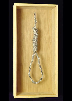
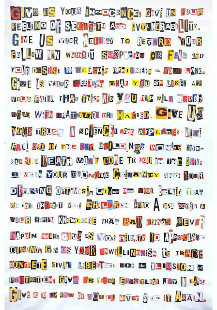
The willingness to trade civil liberties for protection, 2001
Mixed media, 12" x 12" x 18 1/2”
I was at a dinner party of artists after the Patriot Act was passed by congress and they were up at arms. My feeling was whatever price our safety costs, it’s worth it and there will be enough checks and balances in place to prevent any agency of the government from abusing the powers contained in that act. I was in a small, reviled minority around that dinner table of libertarian alarmists.
Gradually, as the details of the act came to light, I saw that my Chicken Little friends were right. The act impinges on numerous civil liberties and gives the government and its agencies powers that would have our founding fathers turning in their graves.
With the Patriot Act, the Bush administration used fear to rush through sweeping diminishments of individual rights to privacy and increases to governmental snooping,
even into the lives of ordinary citizens.
This piece was made from a plaster cast of an Israeli gas mask for children.
It has been covered with the American Constitution and Bill of Rights.

Shell shock, 2001
Acrylic on canvas, 72" x 48”
Every New Yorker who saw this piece remembers it. I think I mentioned this thought to my friend Greg one day and he loved it. I refined the writing a little bit and made it into a large painting. The coloration was a no-brainer. I wanted both the letters and the background to be sky blue. I wanted it to be something that could be read, but not without trouble. The thing about screeching tires is that no matter how many times you hear them, you’re always waiting for the crash at the end of the screech. That’s how it had become with airplanes going over New York City. Now people were nervous. After planes started flying over Manhattan again, you could see the ordinarily blasé citizens of NY stopping on the sidewalk and looking up if the engine was too loud. Another attack?


Magnitude of loss, 2002
2,801 empty hangers, 2 coat racks each 60’ long
+ + + + + + + + + + + + + + + + + + + + + + + +
The Animal Alphabet
26 little allegorical circus posters, one for each letter of the alphabet.

Hare, 2001
Acrylic on canvas, leather thread, grommets, 20 " x 16 "
Hares are symbolically rich. Most cultures have some mythical story about the hare, and ancient cultures worldwide see a "hare in the moon," not a "man in the moon." This painting represents two of the most popular myths: hare as trickster and hare as a symbol of the moon. This hare is juggling little moons, while sitting on the floor beside him is a magician's hat and a deck of cards.

Northern Red Salamander, 2001
Acrylic on canvas, leather thread, grommets, 18" x 18"
The ancients thought that salamanders could walk on fire, and The Physiologus, an early Christian work, symbolizes the salamander as the "righteous man who is not consumed by the fire of luxury and lust."* This painting illustrates what I thought was an interesting ancient belief.

Rattlesnake, 2001
Acrylic on canvas, leather thread, grommets, 20" x 16 "
A snake eating its own tail is a Sufi symbol of eternity. Here, I've shown a rattleshake eating its own tail, devouring that which is warning sign. Against a background of a golf course in the desert, this snake becomes a metaphor for how humans deal with the environment, enforcing our will wherever we want and paying scant attention to natural order and the warning signs along the way.
+ + + + + + + + + + + + + + + + + + + + + + + +
Youth Culture in America
Artist's statement from the exhibition "Youth Culture in America" at Varga@Muddycup Gallery
There is certainly no more dynamic culture in the world today than youth culture in America. “Youth Culture in America” is an exhibition being created that will bring together and present some of the most egregious external influences our kids encounter: from television, cartoons, popular music, advertising, coloring books, peers, abusive teachers and parents, and so on. Some of them are stamped with my opinions (on issues that range from gender stereotypes to the marketing of drugs and sex to teenagers, to violence), and some of them are presented as-is, a conglomeration of both original creations and ready-mades, art and archeology.
The artworks for this show fall into three basic types: illustration and interpretive illustration (a sheet of Bevis and Butthead blotter acid; a gumball machine filled with condoms, joints, and bullets), “connect-the-dots” pieces (a child’s coloring book page superimposed over the pages from an adult’s self-help book) and macabre appropriations (the See-n-Say with explicit lyrics, the Yosemite Sam piece, and the Pin the Bullet Hole on the Schoolboy Game).
On the whole, this was a show of artistic editorials: topical, accessible and hopefully poignant.

Gumball machines, 2000
Gumball machines, gumballs, condoms, joints, .44 bullets, plastic vending machine capsules,
60 x 37 x 21”

Yosemite Sam, 2000
Acrylic on wood, lead, copper, 48 x 25 x 20”
Our national handgun cartoon character. 4 feet tall.

Heroes, 2006
Cotton/acrylic jerseys, different sizes
Eric Harris and Dylan Klebold were the perpetrators of the Columbine High School massacre.
To a certain swath of American youth, their fame is enviable.

Pin the bullet wound on the schoolboy game, 2001
Acrylic on cardboard, packaging, 36 x 17 1/2”
Eating an ice cream and carrying American History.
+ + + + + + + + + + + + + + + + + + + + + + + +
“Chaos is the order of nature and order is the nature of man.”
“A spoon full of sugar helps the medicine go down.”
I strive to create art that is both beautiful and meaningful, art that is aesthetically and intellectually accessible and deals with important themes. This current body of work is on a theme that has informed a great deal of my work over the past couple of decades -- mankind’s complicated and vast relationship with nature.
We use nature how we see fit: we strive to bring order to it, we seek to explain it in a language that doesn’t belong to it, we try to make it prettier, we try to make it better, we try to make it more profitable. Some efforts succeed, some don’t.
This series, “Decorating nature” is about all that and is also all about beauty.
Beauty is the best friend of consideration. If a photo is pretty, the viewer will spend more time with it. If a viewer spends more time with it, they will begin to think beyond the surface of it and into the meaning of it. That’s the dynamic I hope to create in viewers of my work.
Lastly and maybe most importantly, this body of work is meant to be fun.

fig. 1: leaf of the clown tree
watercolor on leaf

fig. 92: certain mosses secrete a pheromone that reacts beautifully with maple leaves
watercolor on leaf

fig. 38: in autumn, some leaves will use color bars to help get everything perfect.
watercolor on leaf

fig. 189: in late winter, some oak leaves begin generating an inordinate amount of heat.
watercolor on leaf

fig. 73: a maple key with cartoonitus.
watercolor on leaf

fig. 144: a tuft from the neighbor's hydrangea floated over in that last storm
watercolor on leaf

fig. 142: some leaves lose themselves in others
watercolor on leaf

fig. 95: some oak leaves self-censor.
watercolor on leaf

fig. 138: beauty follows fast after some Spring showers
acrylic paint on leaf

fig. 186: Sycamore Anthracnose is an alluring but dangerous fungus
watercolor on leaf
+ + + + + + + + + + + + + + + + + + + + + + + +
Dyscommunication
Parts of this series were on view in my "kuh-myoo-ni-kay-shun" exhibition, the first ever solo show at the cma gallery at Mount Saint Mary College.
See the whole series here: https://dyscommunicationexhibition.blogspot.com

Communication Modulator, 2018
Archival computer print of digital image
(click on any image to make it bigger)
This piece is sort of the topic sentence for this body of work, highlighting many sources of difficulty in our communication - factors such as: desired outcome of interaction; actual/perceived strengths of the speaker; likability of the speaker; personal distractions; etc.
History with the speaker, the speaker's tone of voice, etc., there are so many things that can influence how words are heard. Personally, though I consider myself to be a very sincere person, I see my innocent (and even sweet) words being taken as sarcastic or snarky much more often than I ever mean them to be that way.

Mistakes Were Made, 2017
Hand-embossed archival paper, 21" x 17"
When I was a kid, in 1970 or so, Richard "I am not a crook" Nixon said, with regards to the Watergate fiasco, and by way of a non-admission admission of culpability, "Mistakes were made." Even as a youngster, this phrase seemed peculiar. Not the least of it being that if I had ever tried to use this "king of non-apologies" with my mom or dad, I woulda been grounded for life! Here, I take the “desire to say something that SEEMS to be saying the right thing but in fact actually isn't” one step further, presenting the mere shadow of the words, pressed into paper.

The Gettysburg Address Segregated by Letter, 2017
Archival computer print of black Sharpie on paper
 |
| Horse, 24" x 20" Archival computer print on acid-free board |
Frequently, people speak to us, but instead of listening with our heads, we should actually be listening with our hearts. On these occasions, we might miss entirely what they're trying to communicate because of our successful engagement with their words and our failed engagement with their deeper meaning. Read between the lines, as they say. This piece, "horse", is about that "heart/head" problem, substituting "feeling" words for numbers in an online paint by numbers outline.
 |
Fake News, 2018
Etched glass, 48" x 20" $4,000
One side of this glass has the word "lies" on it, the other shows the word "facts". The effect is one of almost complete obfuscation, where neither word is quite clear and each is obscured by the other. I will be making a larger version of this and so this is, in effect, an artist's proof.
"Sure", below, illustrates the baggage that seems to inevitably materialize during any long-lasting relationship. With a boss, with a spouse, with a sibling, or even with a public figure (see "President Donald Trump addresses a joint session of congress" further below). This baggage is created from years of hearing the words that someone actually says and measuring them repeatedly against what they turn out to actually mean, or what you repeatedly think they actually mean. In "Sure", the simple reply to the unrepresented, implied question of where to go for dinner is shown to be rich with the baggage of the personal history between speakers.
 |
| Sure, 2019 archival computer print. 21" x 30" edition of 10 |
This print illustrates the baggage that seems to inevitably materialize during any long-lasting relationship. With a boss, with a spouse, with a sibling, or even with a public figure. This baggage is created from years of hearing the words that someone actually says and measuring them repeatedly against what they turn out to actually mean, or what you repeatedly think they actually mean. In "Sure", the simple reply to the unrepresented, implied question of where to go for dinner is shown to be rich with the baggage of the personal history between speakers.

I'm sorry. A thousand times I'm sorry, 2017
19" x 26", "I'm sorry" written 1,000 times in graphite on watercolor paper
Words and phrases can be overused to the point of completely losing their sharp edge as carriers of thought and sentiment. In this piece, I've written "I'm sorry" 1,000 times on a piece of nice thick watercolor paper.

Siri transcription of NPR report on the bombing at the Brussels airport, 2017
cotton muslin on wool prayer rug, 75" x 34"

Ghoti, 2014
Archival digital print (32 x 32")
"Ghoti" is an interesting word construction that illustrates some of the inherent difficulties of the English language. I was making a study for a new painting and loved the digital study so much that I decided to make a print of it. It's gorgeous.
For more information on "ghoti", click here.
+ + + + + + + + + + + + + + + + + + + + + + + +
Proximity and Distance
(the entire series can be seen here.)
Whereas "GHOTI" teeters on the edge of needing explanation to be understood and enjoyed, the "proximity and distance" series, in my opinion, does not. From a distance, they gain resolution....
The internet is a great forum for bringing people together. It is also, by nature of how we use it, a great isolator -- creating an ersatz society where we can enjoy each other’s company from the privacy and solitude of our own homes. It provides proximity from a distance and allows us to filter our personas through its fun house mirror, presenting to the world only the images we have chosen.
On Facebook, there’s no more manicured presentation of our best face forward than our “profile picture.”
For “Proximity and distance”, I placed my iPhone right up against my computer screen, resting it in the hinge of my laptop. I scrolled each 50 x 50 pixel profile picture into position and snapped the photo, the mechanics of the act restating the very theme of this series. I then brought these blurry photos into Photoshop and further decreased their resolution by making each one a mere 13 pixels across. At this point, I enlarged them as much as I could (3200%, up to 418 pixels across), and took a screen grab of them at that size.
Finally, echoing the social nature of Facebook, I paired them with other pics that felt right with them due to color or composition or some other factor.
This series presents the paradox of social media in all its colorful, amorphous glory. The photographs range from recognizable (person on a horse) to completely abstract; they are, at once, familiar and unfamiliar and, like the people behind them, they evoke emotions ranging from soothing to disturbing to haunting.

Unknown and Jessica, 2015
Archival computer print

Patty and Zoe, 2015
Archival computer print

Kimberly and Monica 2015
Archival computer print

Shelly and Karen 2015
Archival computer print
+ + + + + + + + + + + + + + + + + + + + + + + +
Monsters on Postcards
My more "serious" work has almost always been accompanied by more whimsical work. The "Monsters on Postcards" (and thrift store paintings) series is certainly that. It started out as a fun activity to do with the kids. The kids eventually lost interest, I didn't.

Louise, 2018
acrylic on thrift store print. 22" x 22"

S.S. Unipuss, 2016
Acrylic on yard sale painting, 24" x 33"

Eiffel terror, 2015
watercolor on postcard

The Right Reverend Dr. Murakami, 2016
Acrylic on garage sale painting, 26" x 22"

Green boy, 2013
Watercolor on thrift store print, framed size 12" x 9"

Four pupils 2013
Watercolor on tag sale painting, framed size 11 1/4" x 12 3/4"

Here, birdie, birdie, 2010,
watercolor on postcard.

Alien with crab claw, 2010
watercolor on postcard.

South of South of the border, 2011
watercolor on postcard.

Christina's Trip, 2016
acrylic on thrift store print. 20" x 28"
+ + + + + + + + + + + + + + + + + + + + + + + +
Flags
In 1995, I moved to New Zealand and traveled around that amazing country a whole bunch. On the way there, at the very beginning of our trip, we stopped in Tokyo to stay with and visit friends; there, across the street from their luxury high rise (the Green Park Akasaka) was a book store, and in that book store was a phenomenally expensive enormous coffee table book called "Andy Goldsworthy" put out by some German publisher. Really, not at all the kind of thing one should purchase right at the start of an antipodal adventure. But I had to have it. They pieces were so gorgeous and I'd never seen anything like them before and they seemed like invitations to me. Invitations to do things with natural objects that I'd never considered doing before. Oh, I'd made forts in the woods as a boy and pressed pretty leaves between pieces of wax paper and whittled balls in boxes as a young man, but never anything like this! So I bought the book and brought it to New Zealand with me.

We arrived in N.Z. just a bit after they'd celebrated their sesquicentennial. 150 years since England had planted their flag on this land and claimed it for themselves. And it got me thinking about the nature of sovereignty. The fleeting nature of sovereignty. The Maoris had ruled themselves forever. Where was their flag? Flags come and flags go and, inspired by my recent exposure to Andy Goldsworthy, I decided to make some flags of my own, flags that would be here today and gone tomorrow, flags that would be pretty little meditations on the fleeting nature of sovereignty. Here are a few from that series:

Mint and hydrangea flag, 1996
c-print

Daisy and clover flag, 1996
C-print

Pine needles flag, 1996
C-print
One of the things that strikes me about this series is just how concept-heavy it was. The animal allegories were metaphorically rich, too, I guess, but somehow this series feels like a great shift, placing more emphasison the importance of the concept vs. the importance of the execution.
+ + + + + + + + + + + + + + + + + + + + + + + +
Flower Markers
Place. A sense of place. A place's allure made manifest just through the utterance of its name.
Shangri-la. Hawaii. Home. Places of positive associations for most people.
There are other places, too, the names of which will always evoke horror or sorrow or sadness. Columbine. Auschwitz. Jonestown.
This is a project about the power of a name. Those names.
There are other places, too, the names of which will always evoke horror or sorrow or sadness. Columbine. Auschwitz. Jonestown.
This is a project about the power of a name. Those names.

Chemical Disasters, 2007
+ + + + + + + + + + + + + + + + + + + + + + + +
A plant a day


Mr. Wiggleworm in Love, 2000
Acrylic on plywood, 45 1/2 x 45 1/2”
+ + + + + + + + + + + + + + + + + + + + + + + +
Finding the Truth
From the "Finding the truth" series, begun with George Bush, where I would take his speeches, in their unedited entirety and simply highlighted certain words to find what I thought was the truth of the matter. Political, engaging, and fun. A funism classic!

President Donald Trump addresses a joint session of congress, 2017
archival computer print, 40" x 30"
(verbatim from prepared transcript - below: highlighted words only)
Tonight, as we mark the celebration of our vandalism of truth, liberty and justice --I am here to deliver a message to the middle class. It’s been a little over a month since my inauguration, and I want to take this moment to announce the government corruption and deregulation that threatens the future of their financial dreams. For the American family that loses their jobs, their income, or a loved one, because my Administration — a network of lawless Christians — will be making it easier for companies to abandon protective policy and depress wages, we do not truly care. Mandating no choice is the plan for women’s health, and to advance the common good, a woman should not be free to choose and must not have a voice. Finally, to keep America Safe we must, as the Bible teaches us, all share faith in and all salute the same God. From now on, America will be guided by our vision. God bless you, and God Bless these United States.
"State of the Union"

The economy
Clear skies
+ + + + + + + + + + + + + + + + + + + + + + + +
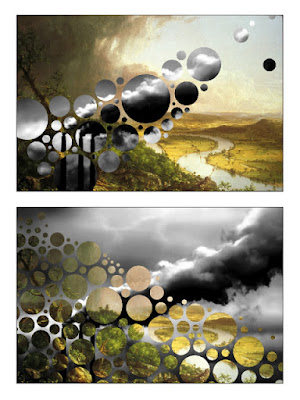
A one-off piece created on the computer, thinking about our landscape then and our landscape now. The pretty green landscape is a Thomas Cole painting, the smokestack belching pollution is from Google images. For me, this is a perfect funism piece: it's pretty, its message is accessible and decipherable by any thoughtful viewer.
Pess/Op, 2006
Archival computer print
+ + + + + + + + + + + + + + + + + + + + + + + +
Décollage

Untitled, 1990/1999
Decollage

Untitled, 1990/1999
Decollage

Untitled, 1990/1999
Decollage
+ + + + + + + + + + + + + + + + + + + + + + + +
Landscape Details
My friend Grace said that she didn't want any art on her walls and went on to say that if she was going to have any art on her walls, she'd want a large canvas that was only blue. That was the beginning of this idea, to take details out of the landscapes that I had been painting, put each detail on its own canvas, hang them together and call it art. These pieces here are watercolor studies for the full sized pieces, only one of which was ever made.

Landscape detail #7, 1993
Watercolor on paper

Blade of grass, 1993
Watercolor on paper

Underneath the big oak tree, 1993
Watercolor on paper

Plowing under the sky, 1993
Watercolor on paper
+ + + + + + + + + + + + + + + + + + + + + + + +
Future Conditional
A commissioned project for the magazine South Writ Large in which I imagined the futures
of people whose lives were cut short by lynching.
From my essay accompanying the project:
"Lynching. Lynching. It means an extrajudicial murder, usually carried out by a mob, usually to bring what that mob thinks of as “justice.” Usually, but not exclusively, the method of lynching is hanging. Usually, historically, there were other means used as well: beating, shooting, evisceration. Usually, traditionally, it was perpetrated by mobs of white Americans, white Southern Americans against Black Americans: including women and children, but men mostly; it didn’t seem to matter. In California, mobs lynched Chinese-Americans, white Americans were lynched, Mexicans, Jews, Italians, Native Americans too. The list goes on. As Bobby Kennedy said, “A mob asks no questions.” "


+ + + + + + + + + + + + + + + + + + + + + + + +
Cow Parade


Pull Toy, 2020
Acrylic paint, leather collar, cow bell and braided rope. Fiberglass body.
+ + + + + + + + + + + + + + + + + + + + + + + +
Below: installation view of the "Funism" exhibition at SUNY/Ulster in 2015.


Early reviews of my new art movement:
The second review of 'funism'. The Village, Sept. 9, 1992

A review of my show at the Springfield Art Museum in 2000.

Another review of my 'funism' art, from 1996.

+ + + + + + + + + + + + + + + + + + + + + + + +
Reviews of "Funism" exhibition:


+ + + + + + + + + + + + + + + + + + + + + + + +
Curation
Well, like lots of artists, the lure of curating was too much to resist and,
over the years, I've curated a number of exhibitions:
Abstract Evocative
2017, at the Woodstock Artists Association Museum. An exhibition of abstract art.

from the exhibition: Gabe Brown on the left and Christopher Engel on the right.
From my curator's statement:
"Abstract art seems to spring forth from one of two directions: from the soul or from nature, and either way it has its own evocative power. That’s what the title of this exhibition refers to: does the art take you somewhere? Make you think of something or feel some way or another? Is it evocative? "
ABC@WFG
2016, At the WFG gallery. An exploration of text-based art.

from the exhibition: Alex Gingrow on the left and Keetra Dean Dixon on the right.
From the (really long) curator's statement I wrote for the show:
WHAT IS TEXT BASED ART?
WHAT IS NOT TEXT BASED ART?Mostly, when we engage with text, it's in the form of signage or advertising or books or magazines, or whatnot, but once in a while, it's in the form of art. Text-based art. A genre that has been around for a long time but has really taken off in the last decade or so.
S0 . . . what is text-based art? Is it simply art with words in it? Is it art where the text (words or numbers) is a central conceptual element or a central compositional or design element? Both? Either?
Beautiful Nonsense
2016, at the Rockland Center for the Arts. Art that breaks us out of our perceptual sure-footedness.

from the exhibition: Robert Rickhoff on the left and Myra Mimlitsch-Gray on the right.
From my curator's statement:
"What power is there in objects that confound us -- objects that challenge our mostly unchallenged trust in our perception of the world and the things in it? Since the advent of Dada and Surrealism and even before, artists have been creating these objects and images; “Beautiful nonsense” is an exhibition that presents dozens of such “absurd objects” for our consideration.
re:Purpose
2014, At the WFG gallery. Conceptually interesting art on or from non-traditional materials.

From the statement I wrote for the show:
"Canvas, marble, watercolor paper, linen, limestone, papyrus, walls, even ceilings. Since the beginning of time, these have been the traditional surfaces upon which or with which artists have created their work. Since the beginning of the modern age, however, these surfaces have been frequently cast aside, as artists began to make their work on any surface and from any material that struck their fancy. This exhibition presents a small survey of art by artists who have made their art on or from non-traditional materials."
The Museum of Controversial Art
2013, At the KMOCA Kingston and later at BAU, Beacon. Three of us re-created, reconceived or recontextualized some of the most controversial art in history.

from the exhibition: "Reparations" on the left, "Piss Buddha" on the right, both by Magnusson.
From the gallery press release for the show:
"KMoCA is pleased to announce an exhibition curated and entirely created by David Goldin, Norm Magnusson and Molly Rausch entitled "Grand Opening of the Kingston Museum of Controversial Art".
FU@WFG
2012, At the WFG gallery. An exhibition examining US Fair Use laws, as they pertain to visual artists.

from the exhibition: James Westwater on the left, Molly Rausch on the right.
The beginnning of the very long curator's statement for the show:
"I’ve long believed that collage is one of the most important concepts in art in the last hundred years.
Maybe the notion above is an original thought of mine, but maybe I read it somewhere; I can’t really be sure . . . does it really matter?"
+ + + + + + + + + + + + + + + + + + + + + + + +
Monologues
Words and images monologues written and performed by Norm Magnusson.
On the prevalence of porn in our society and others throughout history:
On connection, told through the experience of being Bill Murray's stand in
and photo double on Jim Jarmusch's "The Dead Don't Die":
On looking for love in the digital era:
On the signs "out there" and the signs "in here":
+ + + + + + + + + + + + + + + + + + + + + + + +
Children's Books
(links coming soon)
+ + + + + + + + + + + + + + + + + + + + + + + +
Resume


Comments
Post a Comment